Abyssal Archive production update - February 2023

Over the past several weeks, our printer in Italy has been sending Abyssal Archive prototypes to the office. No matter how exciting a particular covering material for the book might seem in the abstract, holding it in your hands – in a shape approximating the final printed book – lets you know what’s working... or still needs adjustment.
This back-and-forth requires patience, as each update must be fabricated anew and sent to us for inspection and approval, but it’s essential to making sure the end product hits our T&F quality bar.
We have been making several adjustments to improve the overall quality of Abyssal Archive, which we’ll take you through in today’s update. (Note: the items below are 'work in progress' so granular details, such as the foil blocking on the slipcase and clamshell box, are missing.)


The quality is already at an extremely high standard, however there were some areas which we felt could be improved.
Book volumes
The covering material we initially chose for Abyssal Archive is called Setalux, which the manufacturer describes as “a tissue lined filament viscose with silk appearance”. (For context, we used a pearlescent gold Setalux variant on the spine of Soul Arts and it had amazing texture as well as a premium-grade finish.)
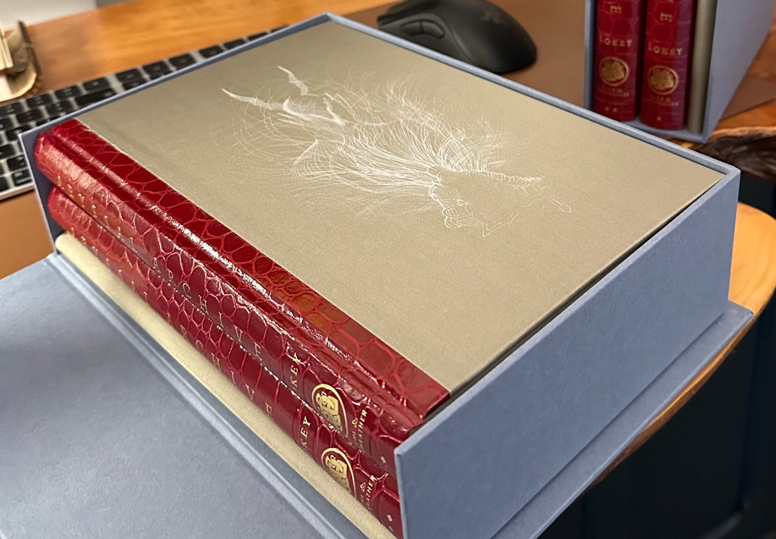
The Setalux cloth, which worked great as a secondary accent, did not work well as the dominant covering material however. Even though it was not the “metal” variant, the regular Setalux cloth had a cold, inhospitable metallic feel in the hands.
Also, the dazzle of light off the silk veneer caused the fine white lines of the cover illustration to disappear in glare while holding the book at certain angles near a direct light source (see photo below for reference). It just wasn’t working.

We are investigating a replacement stock called Savile Row Tweed (Camel) by a different Italian supplier. This option has a more organic feel as well as a distinctly… professorial vibe that fits the academic nature of Abyssal Archive, which offers readers a deep dive into the mythology of Dark Souls.

Fold-out companion map
Unlike the two book volumes that make up the Abyssal Archive set, which are “quarter bound” in Hellkite Drake leather, the folder housing the companion map can only use a single covering material.
Initially this was the tan-coloured Setalux. But this had the same hand-feel issue described above, as well as creating a visual mismatch in the slipcase. The book spines and the map spine exhibited two different materials.


To solve this issue, we asked the printer to create a dummy of the map case using only the Hellkite material. Not only does this allow us to switch the white cover illustration to gold foil, it also gives the map its own identity apart from the books. It breaks up the potential monotony of having all three components of Abyssal Archive looking too same-y.


We also asked the printer to rotate the map 180 degrees so that the “Map of Lordran” emblem with supporting colour text is revealed the moment you start unfolding the map.

Slipcase and clamshell presentation box
Though we love the steel-blue colour of the Wibalin material we’re using, we have asked for a soft-touch lamination to be applied. This will hopefully give a more deluxe overall feel to the set and elevate the first impression.

Also, just for fun, here's the actual photo I snapped of a random, gorgeous door during a visit to Edinburgh last year that inspired the grey-blue shade of the slipcase and clamshell box:

***
Conclusion
We are currently waiting for a revised quote based on the various material upgrades requested. Once we have this back, we should be able to move into final production and get pre-order customers a more concrete ETA for the finished product.

That's all for now,
Jason
p.s. if you have any comments or questions, drop by our Discord and say hello in the Abyssal Archive discussion channel.
